This Chart Explains Nothing!

For a country long thought to be geographically-challenged, maps are suddenly all the rage. Every day a new map seems to be taking the Internets by storm, purporting to show everything from the most popular brands in each state to countries most open to foreigners.
Epitomized by bloggers like Ezra Klein and Max Fisher of The Washington Post, a new field of news and social media seems to consist solely of digging up maps on obscure topics and hip pop-culture references. Some of these maps are playful, but others are more serious. The rise of the infographic can be viewed as part of journalism's "quantitative turn". With the recent entry of tech moguls like Omidyar and Jeff Bezos into journalism, and the proliferation of new media ventures, the conventional wisdom says journalism is moving into a data-driven future.
On the surface this looks like a welcome change. Journalism has long been dominated by pundits and talking heads, who in their attempt to garner loyal audiences and corner ideological markets, have treated facts and data as malleable at best and inconsequential at worst. Different ideological camps now live in different factual universes, rendering honest debate of "the facts" nearly impossible. But traditional narrative investigative journalism has long been stuck in the same mold: the lede, the nut graph, the systematic layering of quotes and examples. Perhaps it does need a change.
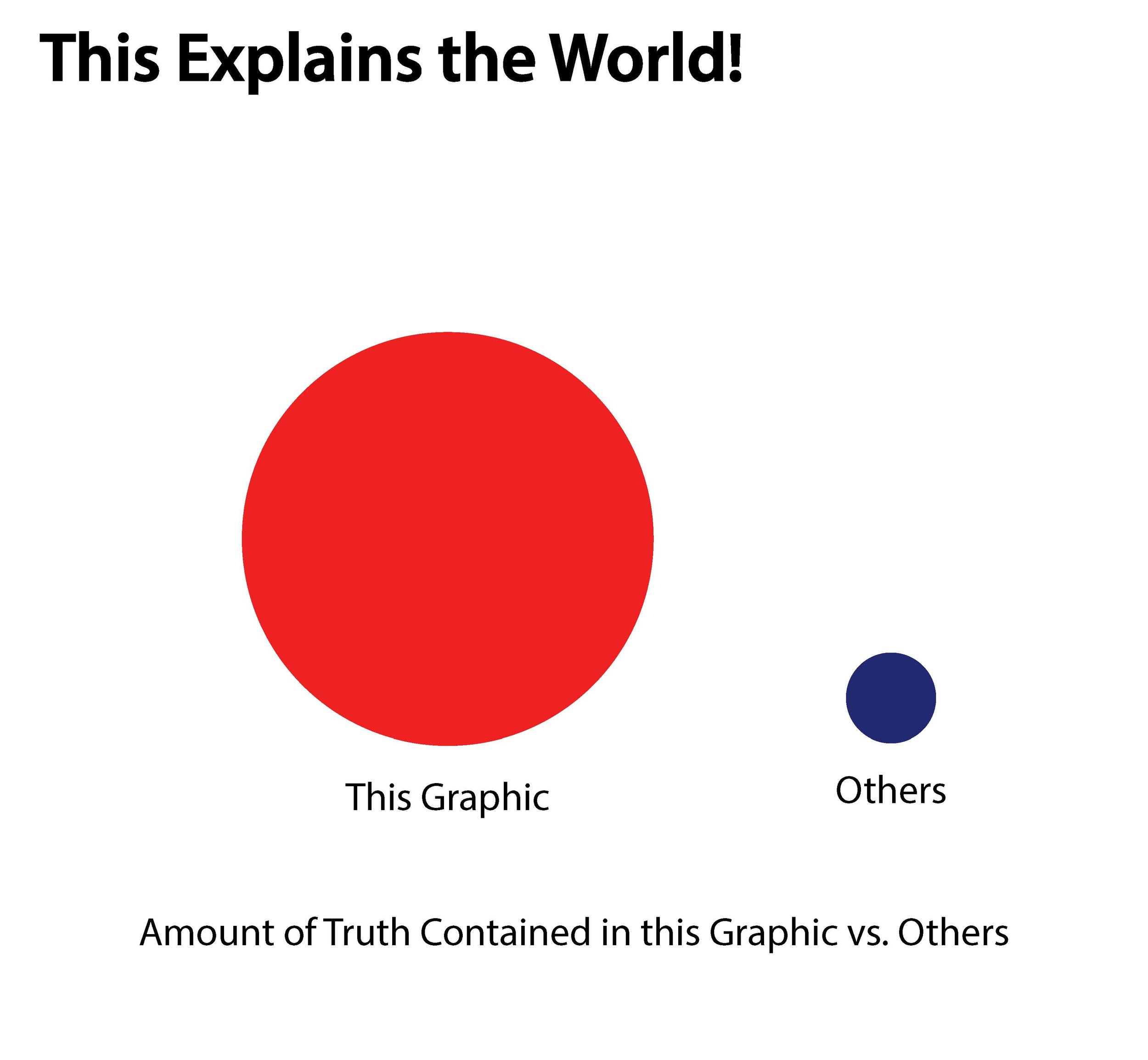
But while the internet and social-media are enabling a data-driven future for news-gathering, it's also creating a deceptive new illusion. If you look at many infographics or maps, they are often wildly hyperbolic and authoritative: THIS MAP EXPLAINS THE WORLD, or THIS MAP SHOWS YOU EVERYTHING YOU NEED TO KNOW ABOUT EVERYTHING!!

This tone might be sarcastic, even jesting. But there is a cynical honesty behind the hyperbole that suggests that at some level, charts and maps are to be taken as authoritative. One might think that by looking at a chart or a map, the troublesome ideological blinders of pundit-driven media magically fall away. But they don't.
To borrow from the words of Slovenian critical theorist Slavoj Zizek, "when we think that we escape ideology into our dreams, it is then that we are within ideology." Or to paraphrase, when we think we escape ideological journalism into our infographics, it is then that we are within ideological journalism.
How so, you ask? Isn't it better to use statistics and charts to prove points? Yes, if the only other choice is Bill O'Reilly or Sean Hannity, I suppose it is. But the "quantitative turn" also exacerbates the belief that our current political and economic problems can be understood simply by reading a graph, bar, line, pie or otherwise. In our current political and economic dysfunction, at least in the U.S, the facts seem as clear as they have ever been, and yet they are also impotent.
It's clear to most who read the Washington Post or any other "mainstream media" that the federal deficit is largely a result of Bush-era tax cuts, two wars, prescription drug benefit giveaways to Big Pharma, etc. However, that doesn't stop a significant minority of people from believing the deficit is all due to Obamacare. To an "enlightened" liberal, the facts speak for themselves. But to those that live in other factual universes, there are other facts to be found in other sources that can explain precisely the opposite.
A recent article explored the conundrum for the left: while the Democrats are winning elections as the GOP becomes ever more radical, they remain blocked from implementing policy. The administration knows what it should be doing, and yet remains hopelessly blocked by a committed and well-funded minority.
In this kind of deadlocked political environment, facts and infographics can only explain so much. In trying to break through such rhetorical deadlock, charts and data are almost as ineffective as polarizing monologues and opinion journalism. But in addition to being ineffective, they are also dangerous in that they perpetuate the notion that we can fix our current problems with a few tweaks: a tax raise here, a slash of this program, a reform of this law, etc. But our political system is much more fundamentally broken in a pathological way.
This is not to say that empirical data has no place in journalism. We need more information and more communication of complex information to the public. But we also need conceptual understanding that bridges partisan divides. Why is it that, even as we have more access to more data and statistics than ever before, we remain unable to form anything remotely resembling a political consensus or will to implement significant reform? The problem is not too little information, but too much.